
A l l e g o r y
Things I am learning about running a small jewelry business.
Tag: fashion
July 18, 2013
The Allegory Philosophy on Product Photography- 5 Basic Shots for Showcasing Jewelry Online
In celebration of my recent under-employement, I have been preoccupying myself with thought about my upcoming photo shoot! It has been quite a while since I had fresh images of my work- far too long, truly.

this shot is OVER A YEAR OLD!
From now onward I am operating under the philosophy of new photographs every season.
I think there is no other sort of marketing tool that can do what photographs can do for a brand. I have listened to so many artists say this over and over again, and have experienced the repercussions for NOT having good images myself. I was contacted about a press release for my first wholesale account with the Museum of Craft and Design in SF, and missed a promotional opportunity to be in the SF CHRONICLE because I did not have good, high-resolution images ready to share.
Even after YEARS of everyone telling me to always ALWAYS have good images at the ready!

Save yourself a face-palm, and make sure you have your bases covered from the get-go.There is no telling when someone may contact you for images of your work- or what kind of images they will ask for. I have seen this working for a number of different creative business owners.
An online retailer might ask for the pieces just cold- against a plain background, no context. Or they might really want to see the jewelry (in my case) on the body to give it scale. Or in a highly-styled outfit or arrangement.
My goal is to have at least 5 different shots for
each item-
1. a basic product shot
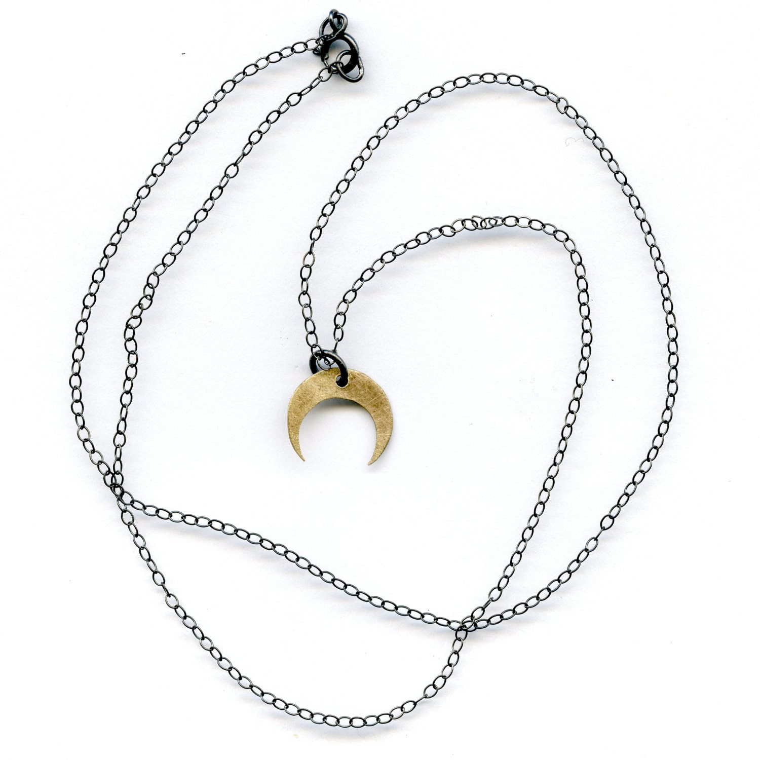
one of my small crescent necklaces
I have been doing this for my etsy shop since the beginning. It seems that a lot of online retailers and sites like Etsy and Pinterest cater towards a “fresh” white background to draw the eye to the piece without distraction. I find the easiest way to make these shots is to put the pieces on a high-resolution scanner. I have been using the ones at the old alma mater, scanning at at least 300 dpi to get a nice, large image. As long as I can get the color balance right, it creates a clean, bright image.
2. a close-up of the piece on the body
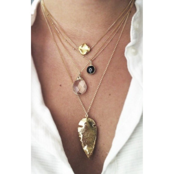
image from Shopkei on etsy
This type of image highlights the specifications of the piece- it’s size, where it rests on the body, how it looks next to actual skin and clothing, etc. Keeping the face of the model out of it (in my opinion) makes it easier to imagine yourself as the buyer wearing the piece. Obviously, take special care in selecting neutral clothing, as a shot like this needs to be simple and not draw the eye away from the jewelry.
3. A styled composition

These kinds of shots are the hardest for me to do, personally. I am not the best product stylist, though photographing still shots like this is AMAZING (you have all the time you could possibly want to make the lighting absolutely PERFECT- something that can be hard to do with a living, breathing model).
You can use this type of shot to show the pieces in relation to each other, and to imagine them as a part of a beautiful little art collection that someone could see and say “wow, I wish I had that lying around my house!”

I don’t think images like this are really as important for a jeweler as a good body-shot, but it is a nice thing to add to your wholesale catalogue to give it a little visual richness. Good eye candy never hurt, and a nice, yummy shot full of interesting textures and colors is a good thing in my book.
Speaking of books, this is a great one about displaying “collections” that has a lot of good ideas about arranging things, that could be helpful if you are like me and not naturally-inclined toward fine styling. I also find looking in a catalogue you admire for ideas (I like the Roost catalogue, personally).


4. A styled “Fashion” shot


Take a few steps back from the close-up. Show a larger portion of the body, show the clothing. Don’t be afraid of creating a “look” or two. In this case, you are showing the style-ability of your pieces. How they can be incorporated into someone’s personal style. Don’t be afraid to add flair, to let your model have expression on their face!


I think a lot of people are afraid of “lifestyle” shots because they don’t want to pigeonhole their designs into one category of person like “sexy chic” or “urban hipster” or “romantic girl” but in marketing, appealing to your niche is important- and there are more people in it than you realize! It’s good to remember that trying to appeal to everyone only makes you brand blend into the background and seem ordinary. You want people to connect with the image and think “I want to look like that” on some level.


If you want, you can think of these images as “print ads.” These are the kind of “lifestyle” shots we are used to seeing in magazines. You know, the kind where people are just casually wearing fabulous, amazing things.

Creating drama and interest is good for these types of pictures- and they can be the most fun! Think about what you want your brand identity to be. Think about the types of people you would like to see wearing your work and then imagine where they hang out, what kind of clothing they wear, how they do their hair and make-up. And don’t be afraid to PHOTOGRAPH IN THE REAL WORLD! If you think your customers are the type that shop at farmers markets, pick wildflowers by the side of the road, and feed ducks at the pond, then take your camera and get your model “acting” this out. Use environment to your advantage!

A friend of mine makes a living making and selling punk clothing. I have photographed for her brand Deranged Designs a number of times now, and she picks environments she can see her clothing in- cemeteries, punk warehouses, lots full of cement and graffiti, and broken down trains, to name a few.

I took this shot in Sacramento on the golden bridge that is the closest thing to a city landmark there. In a way it showcases Annie’s locality

it’s Me-From-the-Past at the Oakland Cemetery. Cemeteries are nice and tranquil, semi-private and have beautiful greenery.

Another of my shots for Deranged Designs. Laura Bee in front of art deco mausoleum gates at the Oakland cemetery.
People WILL notice you taking pictures in public most of the time (especially if you have lights set up or are using a flash) but they usually aren’t intrusive, if you just ignore them. Just keep talking to your model so she doesn’t get shy and awkward about people staring.
These are the images that you could use as the splash page on your website, and are EXCELLENT for Pinterest and other social media.
The photos for the jewelry line Takara are a good example of this.

She has these really cool location/fashion shots, and then really stark products shots

I adore her work!
And, finally
5. Seasonal Shots


I think these are good supplemental shots for online listings on Etsy or an e-commerce site. I am a firm believer in “The more images, the better” and having seasonal photoshoots are a good way to keep up with style trends and show that your work is versatile and still current. Also, you can change the look of your whole store and your listings with the seasons- no beachside shots around the holidays and no snow or heavy coats in June. I just think it’s another layer of selling psychology.
Also, having seasonal photoshoots will give your blog and social media followers something tasty to look at, like, and share, on a regular basis. It also shows that you are reinventing yourself and redefining your brand constantly.
My advice is to keep an inspiration board. Whenever you see an image and think ” I could see my product there!” or ” I love the light” and etc, save the image for reference later.

If you want to see how I do it, take a look at my Pinterest board “Photo Inspiration” where I pin clothes, images, lighting tips, and make-up/hair ideas.
Ultimatly, I think that no matter how you decide to photograph your work the most important thing to remember is to make sure your images are consistent throughout you store- in feeling, color scheme, and tonality, if not exactly the same. This just makes it more like looking at a well-curated art show than a jumble of different colors and themes and seasons. This could mean a lot of work, but it is worth it!
I look forward to sharing the results of my upcoming photoshoot with you guys to show how I plan to put this into action! It should be within the next month and I am so excited!
